Templates for plotnine
Python package plotnine presents a ggplot2-based realization of the “Grammar of Graphics” with matplotlib background. Actively using LaTeX package pgfplots for plottings, I found plotnine useful to do make drawings directly in Python with a reasonable convenience of previewing in Jupyter notebooks and exporting into png/svg (for further assembly in Inkscape).
Resources
- Textbook-like online manual: https://r-graphics.org/
- Reference on
ggplotfunctions: https://ggplot2.tidyverse.org/ - Matplotlib colormaps:
Preamble
Typical preamble
import meshio
import pandas as pd
import numpy as np
import plotnine as p9

from glob import glob
from os.path import join as pjoin
from matplotlib import rc
rc('text', usetex=True) # use tex fonts in labels
Note that the LaTeX texts are exported as paths to svg. Thus, they are not editable as text and do not require font embedding, which could be as positive aspect as well as a drawback. To have them embedded, figure should be exported as PDF.
Plotting a few lines in the same axes
Say, we have two datasets saved in files result_size_24.dat and result_size_58.dat which are different by size of the sample analyzed. The first step is to create a joint dataset, where the column size will be used to distinguish the initial datasets:
df1 = pd.read_csv('result_size_24.dat', sep=' ')
df1['size'] = 24.
df2 = pd.read_csv('result_size_58.dat', sep=' ')
df2['size'] = 58.

# $ cat result_size_24.dat
# time magnetization
# 0.000000000000000000e+00 2.210569005689148714e+00
# 1.212121212121212155e+00 2.247376865418724279e+00
# 2.424242424242424310e+00 2.211233780883315791e+00
# 3.636363636363636687e+00 2.257762135137621584e+00
# ...

df = pd.concat((df1, df2))
Other useful options for read_csv are header=None and skiprows=1.
By default, labels for axes and legends are taken from the dataset column captions. While axes labels can be easily changed, this is not true for legends (at least, if you want to keep automatic selection of symbols and colors instead of manual assignment of them). Thus, a reasonable way is to add a few new columns into the dataset df, which will be properly labeled. Say, dataset contains columns time and magnetization we want to plot:
xaxis = r'\rmfamily Time (min)'
yaxis = r'\rmfamily Magnetization $M$ (emu/g)'
groupby = r'\rmfamily Sample size (nm)'

df[xaxis] = df['time']
df[yaxis] = df['magnetization']
df[groupby] = df['size'].transform(str)
Two important points here:
- LaTeX font selection
\rmfamilyis used to override the default\sffamilyfont just because I like it more. - Since
sizeis numerical (for purpose in this example), we need to convert it to the text withtransformmethod. Of course, one can use own functions as well as lambda expressions here.
The simplest plot is generated as
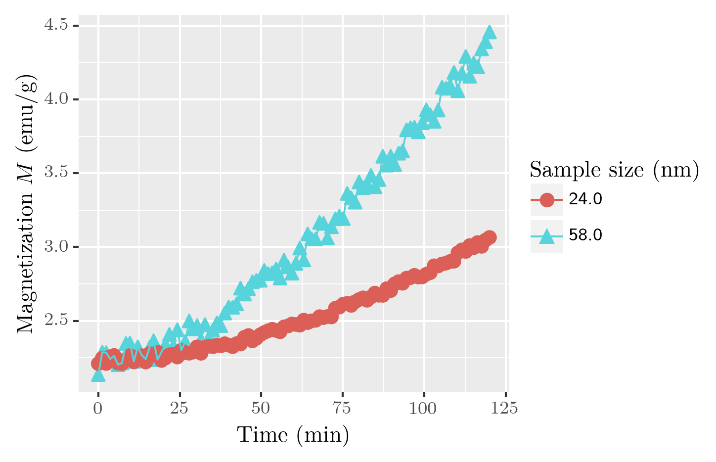
fig  = p9.ggplot(df, p9.aes(x=xaxis, y=yaxis, shape=groupby, color=groupby)) +\
       p9.geom_point(size=3) + p9.geom_line()
fig.draw()
Here, shape of symbols and color of symbols/lines is determined by the groupby column.
Legend
A common default position of the legend is at the right hand side of the plot. This can be changed with theme class. Let us apply one of the pre-defined themes (theme_bw()) to the plot and then change particular legend parameters:
- position of the legend (given in percents):
legend_position - directly specify vertical alignment:
legend_direction - remove legend background (by
p9.element_blanck()as some kind of equivalent ofNone):legend_background - remove legend title:
legend_title
fig  = p9.ggplot(df, p9.aes(x=xaxis, y=yaxis, shape=groupby, color=groupby))
fig += p9.geom_point(size=3)
fig += p9.geom_line()
fig += p9.theme_bw() # <- one of pre-defined themes
fig += p9.theme(
    legend_position=[0.3,0.7]
    , legend_direction='vertical'
    , legend_background=p9.element_blank()
    , legend_title=p9.element_blank()
)

fig.draw()
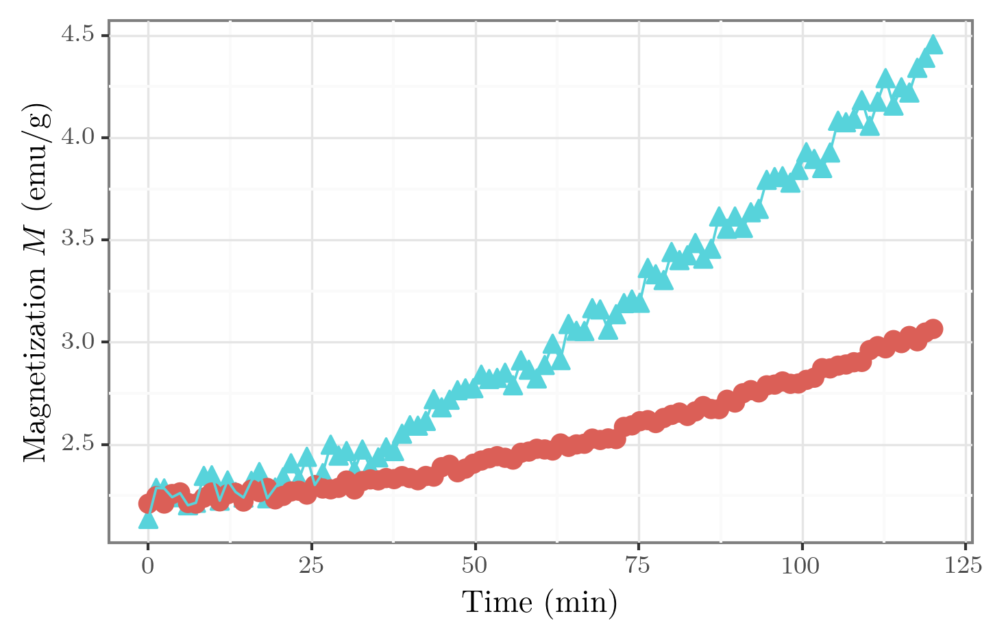
Legend position can also take values 'top', 'bottom', 'left', 'right' and 'none' (the last one removes legend).
Complete list of theme options is given in the official documentation. It also includes axes and ticks labels as well as grid options.
Axes properties
Play with axis ticks can be managed via scale_x_continuous for the plot type considered here. Default plot range is selected automatically and supplemented by a small expansion.
In the following snippet we
- set custom set of ticks for the x axis:
breaksthat assigned by Numpy array - specify limits narrower than the original dataset:
limits - disable automatic expansion of the limits:
expand - For the y axis, the only limits are specified by a class
ylim(same,xlimexists for the x axis as well.
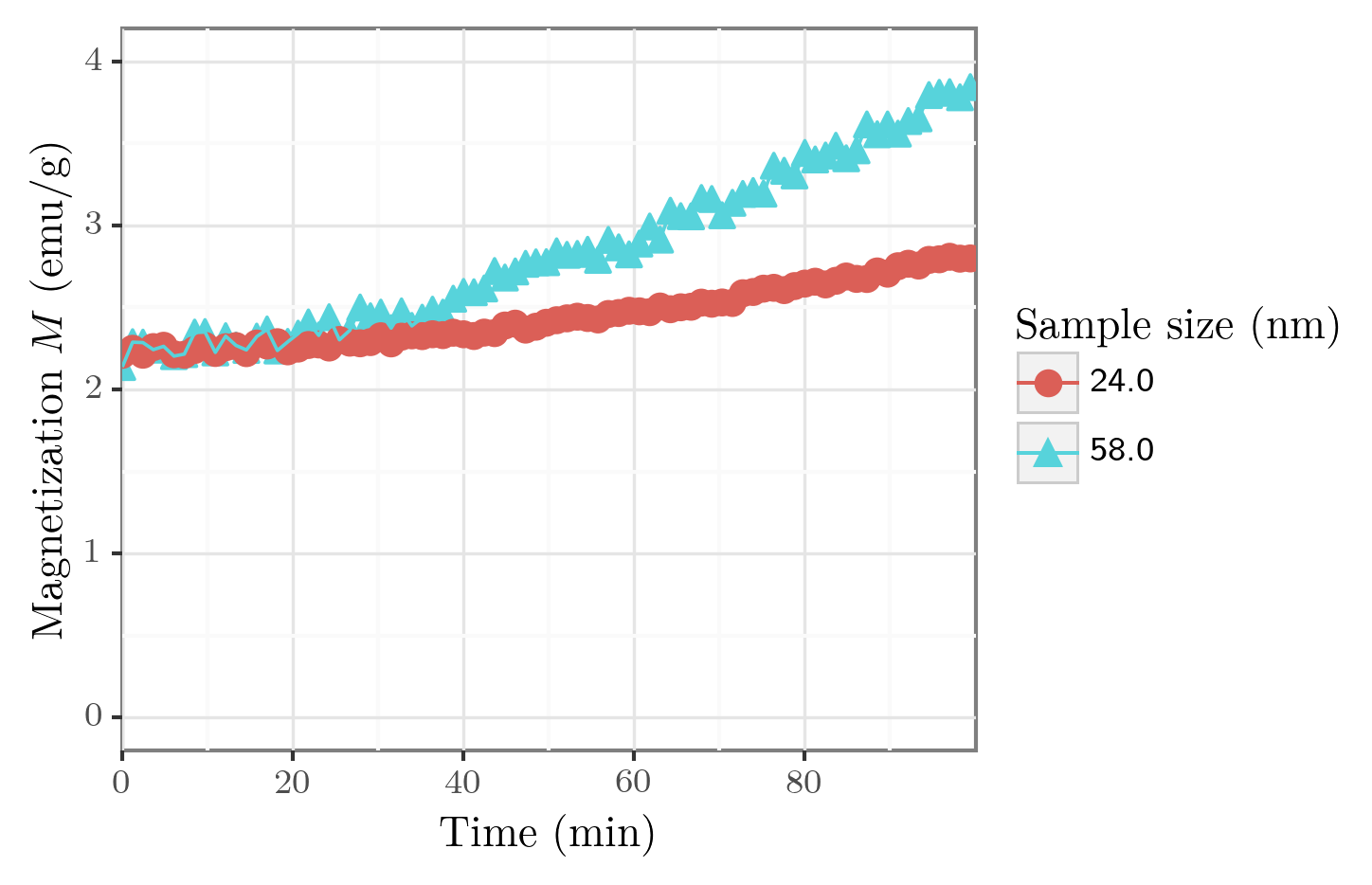
fig  = p9.ggplot(df, p9.aes(x=xaxis, y=yaxis, shape=groupby, color=groupby))
fig += p9.geom_point(size=3)
fig += p9.geom_line()
fig += p9.theme_bw()
fig += p9.scale_x_continuous(breaks=np.arange(0,100,20), limits=[0,100], expand=[0,0])
fig += p9.ylim([0, 4])

fig.draw()
Different data representations on the same axes
A more tricky case is to show data which has different representations (e.g. symbols and lines) on the same axes. For this, we need to prepare the dataset accordingly and specify what dataset parts should be used for each representation.
For example, let us fit one of the datasets to show raw data with points and fit with a line. First, we filter the original dataset having in mind that the sample size of 58 units is a floating point number, so direct comparison == could be misleading in a general case. Then we set a column 'curve' to identify this dataset as the original data.
df1 = df[abs(df['size'] - 58.) < 0.001].copy()
df1['curve'] = 'data'
We build the line fit using curve_fit from SciPy and create a dataframe for the fitted data:
from scipy.optimize import curve_fit

def fitfun(t, a, b, c):
    return a*np.sqrt(b + c*t**2)

popt, _ = curve_fit(fitfun, df1['time'], df1['magnetization'], p0=[1, 5, 0.001])

xx = np.arange(0, 120, 1)
dffit = pd.DataFrame({'time': xx, 'magnetization': fitfun(xx, *popt), 'curve': 'fit'})
Finally, both datasets are combined:
df0 = pd.concat((df1, dffit))
And the dataset can be displayed:
xaxis = r'\rmfamily Time (min)'
yaxis = r'\rmfamily Magnetization $M$ (emu/g)'
groupby = 'curve' # this column already exists in the dataset

df0[xaxis] = df0['time']
df0[yaxis] = df0['magnetization']

fig  = p9.ggplot(df0, p9.aes(x=xaxis, y=yaxis, color=groupby))
fig += p9.geom_point(
    data=df0[df0['curve'] == 'data'],
    size=3
)
fig += p9.geom_line(
    data=df0[df0['curve'] == 'fit'],
    size=1
)
fig += p9.theme_bw()

fig.draw()

Here, within geom_point and geom_line we select parts of the datasets to display with the given representation. To change legend labels, one needs to create a new groupby column with proper strings to group by.